Let's be honest, folks. You’re behind your computer screen, looking at graphs all day long. Your eyes are bleeding green and red. You're chasing pumps and dodging dumps. The last thing you need is a crypto platform that looks like it was designed by a committee of colorblind engineers in 1998. We're in 2025, people! Where's the visual love?
Why Does Everything Look the Same?
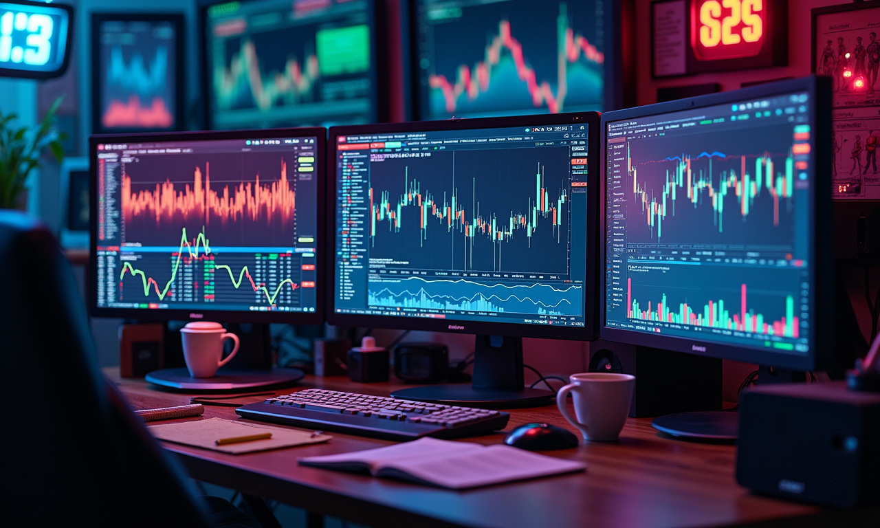
Enable fire on at least half these venues—Binance, Bybit, Kraken, MEXC. No, really, who names these things? They all bleed together into a blurry, confusing mess of candlesticks and order books. Product features They claim to have powerful trading tools, liquidity, low fees, and security economic factors. Okay, great. But what about my eyes, huh? What about my soul?
It's like they all went to the same "Crypto Platform Design 101" class and copied each other's homework. Rows and columns, endless data points, a color palette snatched directly from a corporate spreadsheet. Where's the spark? Where's the joy?
I get it, reliability is important. We all want a stable trading environment. We need a digital dollar that doesn’t get rug pulled when Bitcoin goes down the tubes. Perhaps that’s expecting too much, but can’t we at least ask for some style? A little bit of pizzazz?
Crypto Bro Aesthetic Must Die
Let's talk about the elephant in the room: the pervasive "crypto bro" aesthetic. It’s all hyper-masculine, aggressively technical and, quite honestly, a bit scary. It's like these platforms are actively trying to scare away anyone who isn't already fluent in blockchain jargon.
I’m speaking for the overuse of heavy blacks and neon greens. Don’t get me started on those ridiculously small fonts and cramped displays, with more information shoved onto each screen than we ever imagined possible. It’s almost as if they’re communicating, “If you can’t deal with this, you aren’t cut out to be here."
We’re living in the moment of digital art, NFTs, and an increased understanding of the power of visual culture. Why can't crypto platforms reflect that? Why do all the deliverables have to look like a Bloomberg terminal on steroids? Is it fair to think that Crypto.com and Gate.io will be a bit better? Maybe. Are they good enough? Probably not.
Now picture an online platform that’s just as creative and colorful. With simple, easy-to-understand visual indicators providing direction, it makes trading fun and thrilling like it’s a game! Is this too much to ask?
It’s high time to move on from the crypto bro aesthetic and build a better, truly inclusive, and highly engaging future.
Think about it: we interact with beautifully designed apps every day. Whether on Instagram or Spotify, these platforms know what keeps their users coming back for more. They know that aesthetics matter. They’re aware that a pretty interface is often an improved interface in terms of usability.
Trading Platforms or Soviet-Era Dashboards?
For starters, why aren’t crypto platforms more ahead of the curve? Or are they just scared that a taste of design would, in some insidious way, undermine their authority. Is it because they believe traders are only interested in the most cold, hard facts?
We're human beings. We're emotional creatures. We respond to visual stimuli. And when we're making split-second decisions with our hard-earned money, we need a platform that's not only functional but inspiring.
Phemex, Pionex, Coinbase, KuCoin… they all suck into this pit to greater or lesser degrees. They do not bother with the form aspect at all, and users are left with UIs that are tedious, contradictory, and, if I may quote Fight Club, soul-crushing.
It's like trading on a Soviet-era dashboard, except instead of managing the five-year plan, you're trying to predict whether DogeCoin will moon.
Tyler Grant is the Editor-in-Chief of CryptoNinjas.net. He is seen as an expert in the field of cryptocurrency trading, blockchain, and financial analysis, news outlets reported. I’ll wager that he hasn’t had to look at these painful/ugly/cringe producing interfaces all day.
Now I’m not suggesting that every crypto platform has to be a Candy Crush. That said, a touch of visual glamour would be hugely beneficial. A less cluttered interface, a more user friendly experience, a color scheme combination that doesn’t make me want to vomit…these seem like pretty basic expectations.
So, to all the crypto platform designers out there: please, for the love of Satoshi, hire a decent UX designer. My eyes—and my portfolio—will thank you. Streamline access to those educational materials. Make it easier to execute orders. Oh, and for heaven’s sake, have it at least somewhat resemble something designed in the 21st.
So, to all the crypto platform designers out there: please, for the love of Satoshi, hire a decent UX designer. My eyes—and my portfolio—will thank you. Make it easier to find those educational resources. Make it easier to execute orders. And for God's sake, make it look like it was designed in this century.